A simple comparison
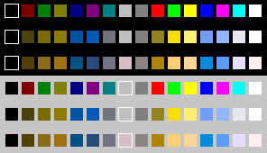
First look at the Windows 16 colour palette for a clear idea of which colours are likely to cause confusion. The top row is the normal palette, the second row simulates the appearance to protanopes, and the third row to deuteranopes. The next three rows are the same colours as seen against a grey background.
Comparing more colours
Below is a side-by-side comparison of how the 216-colour palette (the number most browsers were able to display in 1997) files look, as viewed in a PaintShop Pro (PSP) colour palette window, in hue order. (The colour order in the supplied palettes is different).


Now, originally, I had prepared some palette files that could be used with PaintShop Pro and Photoshop (back in 1998) which you could apply to any image and it would give you an idea of what that image would look like if you were colourblind.
Trying out your own pages
However, technology has moved on, and rather than try to figure out how the old palettes can be redone to work 20 years later, I have found a web site where you can upload any image and explore how it looks from different kinds of colourblindness. It’s not new, but works much more easily than my approach. Visit Colblindor here
For testing your web pages, I’ve found Toptal – Colorblind Web Page Filter, which you can use to view any web page.