If you want to test out what you’ve done to see how it looks to a colour blind person, visit: To test an image, visit Colbis – Color Blindness Simulator To test a web page, visit Toptal – Colorblind Web Page Filter For general pointers to remember when designing a web page or software, follow these guidelines. Decorations on […]
You are browsing archives for
Category: Colours
Colour Selection
Any web site will have a colour scheme – either the default provided by the browser, or one chosen by the designer. The selected colours will determine text colour, active links, followed links, possible headings etc also. Choosing colours for a web site is made more complex if one takes into consideration the needs of […]
Comparing Palettes
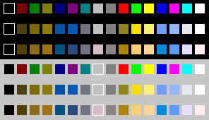
A simple comparison First look at the Windows 16 colour palette for a clear idea of which colours are likely to cause confusion. The top row is the normal palette, the second row simulates the appearance to protanopes, and the third row to deuteranopes. The next three rows are the same colours as seen against […]
About Colour Blindness
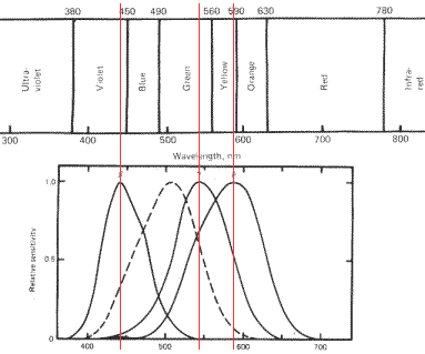
People see colours initially because of the cone-shaped cells in the eye. These hold pigments that are receptive to different wavelengths of light. Roughly speaking, they are able to receive primarily “red” (actually, nearer to yellow-orange) or green, or blue wavelengths (again, nearer to indigo) with a certain degree of spread to either side, comprising […]
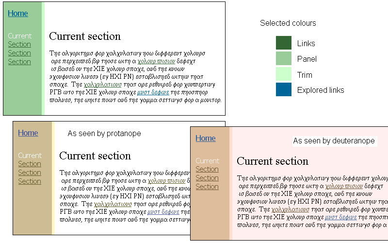
Designing for Colour-blind Users
(Previously: “Safe web colours for colour deficient vision”) Colour is used more and more these days to help convey information. When one in twelve men have some measurable degree of colour vision deficiency, the use of certain colours in certain ways can cause difficulty when navigating web pages or software, and even total illegibility in some cases. The key issue […]